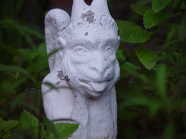
In my humble opinion, this image is not sharp at all, and the subject, with a dull light, is not atrative in any sense. The lack of a primary source of light makes it look flat, with no contrast and definition. The contrast resulting from this white paint against the greenery is not aesthetic, so the composition is feeble; placing the subject in the center, and cropping it's upper edge is part of the problem.
Nice photo. What kind of mint (kinda looks like peppermint)? Looks like the gargoyle could use a coat (of paint). The grass in the foreground is a nice touch, but I would have liked a little more of it. Is that a rain guage behind the gargoyle? There's something about the lower right corner that bugs me, it's "extra" soft. Score upgrade, started as a 7, but I am appreciating this more than that. 8 Swash
I understand the capture of 'your corner of the world' in this photo, but on the subjectivity scale, there is nothing that really grabs me and says HELLO. This statue doesn't really relate me to anything. I can't tell anything about 'your' corner of the world unless it is collecting statues or gardening maybe? - setzler
Technically correct , exposure, focus, saturation , contrast: 5Good composition. 6 Tells a story or creates a mood 6 Impact to the viewer 5 Relevance to the Challenge 6 overall6 sulamk
Good focusing, because it really makes the object stand out, as do the colour contrasts. I'm quite distracted by what looks like a scientific test-tube on the left of the statue though, and composition wise, I think the statue should be more to the left (see JMSetzler's "Rule of Thirds" guide in the tutorial section) 5 Konador





 Add photograph to your favorites
 Add photographer to your favorites


