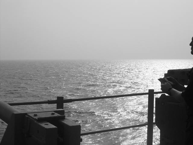
interesting shot :) I like the sun glare on the water quite a bit... compositionally, I think you should have included more of the person on the right side of the frame... having the face sliced as it is here seems a bit odd... good shot :) = 7 - setzler
I think the figure on the right should be included more, or eliminated. While framing the shot, the object on the left could be seen less than the figure.
Nice idea. However, I would like to see a bit more of the profile on the right. The way it is looks a bit odd. I see a profile and no neck. Sort of like a head floating into the picture. Black and white works well.
For me personally I'd of liked more of the guy to the right. Either more or none at all. I don't think he adds much here and is distracting. Over all I love the shot, the b&w is very good as is the reflecting water. Score 8 Justine
The light on the sea is very nice. I'd like to have seen either more of the person, or not at all. The very little showing makes me feel something is cut off. What is the object on the left? Perhaps if more of that were included it would enhance the theme. Your horizon is nice and even. So often people unitentionally tilt it. Like ME!!! Good job! Good luck in the challenge. Grayce aka Gracious






 Add photograph to your favorites
 Add photographer to your favorites


