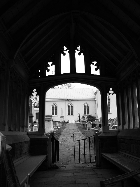
Excellent example of architechture... I'm wondering what this shot would have looked like if the camera were a little lower to the ground and not as much black space at the top of the image....
I like the photo - great contrast. I think it would be better if it was cropped so that the door/opening took up more and there was less black space at the top. But still, a very good photo.
I like this shot, but I would have liked to have seen more light here in the front, to see what this entryway looks like. Also I would have closed both sides of the gate. The B&W gives it a great look.
I love how the light wriggles up into the blackness, but it's at a funny angle. Did you try moving a bit closer to squeeze that stuff in the bottom left off the frame?





 Add photograph to your favorites
 Add photographer to your favorites


