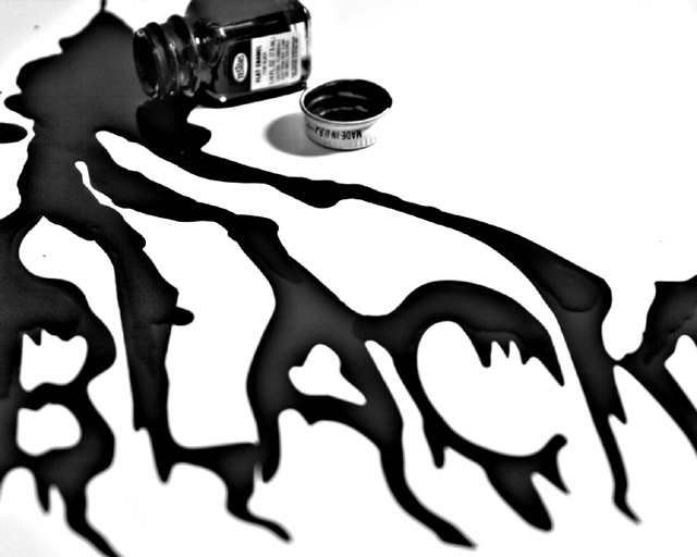
This was a last minute rush job to get an entry into the Black challenge. Total time from idea to upload was about 20 minutes. I dumped some paint onto a sheet of paper and spread it around with a small brush, then laid the bottle and cap on the paper.
Statistics
Place: 9 out of 142 Avg (all users): 6.3897 Avg (commenters): 7.4118 Avg (participants): 6.2674 Avg (non-participants): 6.6000 Views since voting: 3103 Votes: 136 Comments: 24 Favorites: 3 (view)
Thanks for all the comments. They are very much appreciated.
I am truly amazed that this entry did as well as it did. I came up with the idea at the last minute and my wife was rushing me out the door because we had a dinner date. I only had a short time to setup the shot, take a few shots, edit quickly in Photoshop, and get the image uploaded. The total time from idea to upload was literally only about 20 minutes. I knew there were problems with the focus, and I over-edited the image as well, but my wife would not let me spend more time on it. It’s all her fault! (Boy, it’s nice to have someone to blame for your mistakes, eh?) Anyway, I’m lucky it did well.
Perhaps it’s not a coincidence that I was also rushed to get my entry in for the Textures II challenge. I’m afraid it’s not doing as well as this one did. Oh well, there’s always another challenge.
Hello Michael! Congrats on your top 10 placing, on only your third entry.
Positives: I really like the composition with the model paint bottle in the top left, running down and forming the word "Black". The focus on the bottle and initial spill area is good as well.
Possible Improvements: I'm going to say the shallow DOF detracts a bit. Personally, I like the way it is, but I think I agree with the other comments that it may be even better if it was entirely in focus. As someone mentioned below, the right side of the cap is blown out and blends into the white background.
Overall a unique take on the challenge that was done very well.
I like the idea. I think you turned the contrast up a little too much, the white bottle cap blends into the background which I don't like. Having a bigger depth of field so that the bottom of the letters was in focus would also help. But overall, a great job, it stands out from the rest of the entries






 Add photograph to your favorites
 Add photographer to your favorites

 Photographer found comment helpful.


