Author Thread Comments Made During the Challenge
Post actions
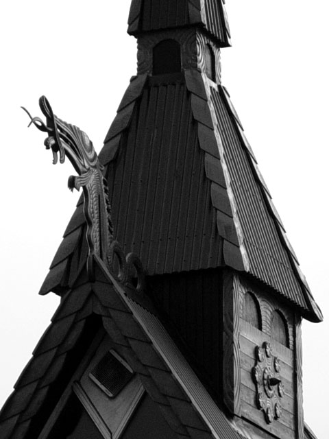
nice black and white... would it have been possible to include the top of the building? good work... - setzler
Post actions
Composition: Subject Placement, Cropping, Background7,
Post actions
Very cool! I love your framing, and black and white works very well. 10 from me - lisae
Post actions
What a wonderful building! I find myself wanting to see more of the dragon head. Would love to see some other angles of this photo when the voting is over.
Post actions
Cropped too much, no end to the picture on the edges, left wanting more on either top, bottom, or sides?
Post actions
view seems too isolated and cut off. The roof line draws the eye right up and out of the picture. Good exposure control and demonstration of texture.
Post actions
Post actions
Very cool. Good contrast. Nifty zoom-compression.
Post actions
looks good! for me it would be interesting to see also the top of the building (church?)...
Post actions
Interesting building. Would like to see whole steeple. JEM
Post actions
Great subject. It would have been better if more detail could have been seen in the forground and also much better if you got all of the "steeple" in the picture. Is this a church?
Post actions
very nice. don't know if it is for sure, but seems like an arnit shot.
Post actions
Frábær hugmynd, flott mynd :)
Post actions
I married a Swede. Good luck.
Post actions
Interesting building, indeed! It seems like much of the front is a little underexposed, though...





 Add photograph to your favorites
 Add photographer to your favorites


