I'm seeing good and bad here.
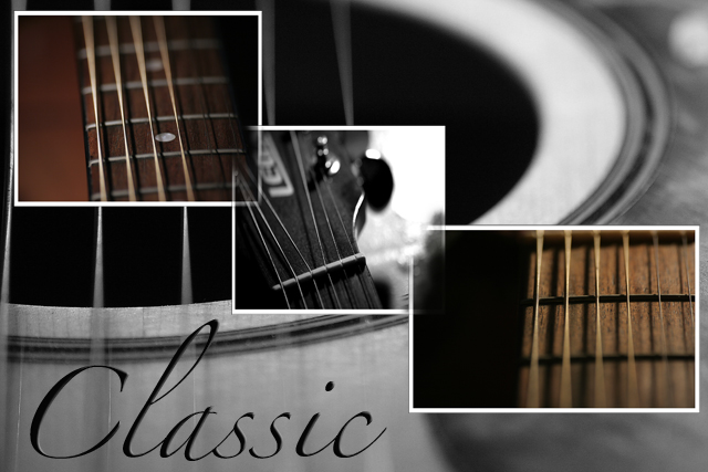
I like the overall composition, the diagonal, the mix between color and b&w, the individual photos and the whole theme.
What I don't like is what you've done on the half hearted thing you did to the overlapping frames - you sort of (but not really) erased the frames at those points.
I think you need to make up your mind which way to go - either leave them and play with the way they are layered/staggered, or merge/erase those corners properly. |




 Add photograph to your favorites
 Add photographer to your favorites

 Photographer found comment helpful.
