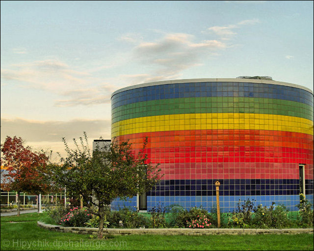
I think that building really is glaringly out of place in that beautiful pastel image. I love the rest of your shot and wonder if the building is as much of an eye sore in reality as it is in this composition.
I hope you realize I'm not criticizing your image. The focus, and DOF are excellent, and I love what you have done with the sky and landscape.
You will never get lost when you have a beakon like that in your neighbourhood. It must be great fun to give directions to new people, you can send them by the school just for fun. "Now turn left just past the round rainbow coloured school." I'm laughing just thinking about it.
I'm curious if there are other angles this might have been taken from that would make it even more interesting? The colors seems a little flat. Maybe additional contrast or if the light were stronger it would "pop" a bit more.
That is one cool building! The image is well composed - a good balance of foreground and sky and nice placement of the main subject off to the side. However, there are some issues with regard to sharpness that could easily be remedied. In addition, the sky has a strange look about it (as if it is slightly blotchy).
Easily fits the challenge but lacks any real WOW power to it. Appears technically clean and has a decent composition but nothing to really set it apart.






 Add photograph to your favorites
 Add photographer to your favorites

 Photographer found comment helpful.


