I knew I wouldn't get a real rainbow. Besides, most rainbow shots I've taken aren't that wonderful.
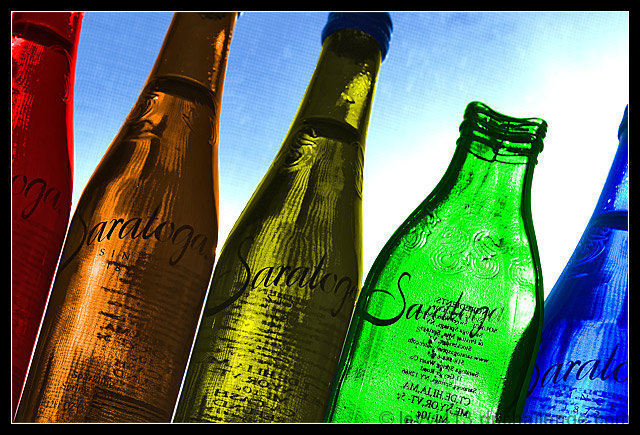
These are bottles of Saratoga spring water, from Saratoga Springs, NY. We were up there this weekend for a family wedding, and they were in a gift basket for out-of-town guests. The bottles are really the blue color on the right; I changed the colors using Photoshop's color blending mode. The flat one is something to hang on a wall; there's a wire loop folded back behind it that you can hang on a nail.
The screen texture is the window screen outside the window where I lined up the bottles. I originally used a larger aperture to blur it out, but then tried a smaller one and liked the effect of the lines in the bottles.
I first colored the bottles, then sharpened the bottles and blurred the screen background a bit. I knew I couldn't obliterate it entirely or risk a DQ, and in the end, I actually liked it. Next was some perspective correction - I knew it was off-kilter when I took the shot, but I had to shoot up at them and from the left to put the sun behind them. So I used the distort transformation to pull the bottom right over more than the bottom left.
I then had a perfectly straight row of bottles, which was boring, so I rotated and cropped. Resized and did another round of sharpening (this time including the screen), added the border, and submitted.
Statistics
Place: 28 out of 93 Avg (all users): 5.9801 Avg (commenters): 7.8000 Avg (participants): 5.8298 Avg (non-participants): 6.0260 Views since voting: 1941 Views during voting: 341 Votes: 201 Comments: 12 Favorites: 2 (view)
My first impression is that this photograph is very strong both compositionally and technically. The back lighting is great because it brings out all of the details of the bottles. I especially like the details of the screen in the background. It gives a nice texture to the photograph without being too distracting.
Compositionally, the angle of the crop gives some nice variation in the photo. I also like the "odd bottle" because it gives the viewer a specific focal point by breaking up the repeated pattern.
The one thing I would like to change is the negative space surrounding the orange bottle. Because of the halo created by the negative space, my eye keeps being drawn to the orange bottle, as opposed to the green bottle. The green bottle is bordering on a secondary subject, and therefore I think if the bottles were arranged in a way to have the negative space around the green bottle, that the focal point would be that much more reinforced.
Overall I think this is a wonderful image. I would have liked to see it score higher than it did.
Saratoga as in Saratoga Springs, NY? If so - how cool!!! If not, it makes me think of home. I like the composition and angle of the bottles. I like the lighting and the faint mesh pattern adds a nice, yet not overpowering texture. Aside from sentimental reasons, I hope this finishes in the top ten! Good luck.
Jeffrey, couldn't vote, but wanted to comment. I really like this one. the composition is very pleasing, as the tilt is just the right amount. I like the colors in the bottles. A very nice take on the subject. Well done.





 Add photograph to your favorites
 Add photographer to your favorites

 Photographer found comment helpful.


