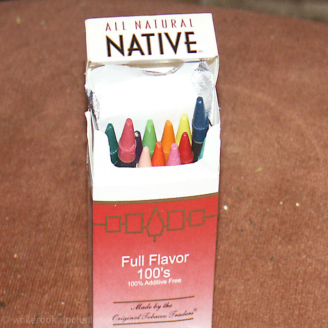
You clearly have the colors of the rainbow in a rather unorthodox package. But the extremely blown out whites and the rather odd and unattractive background hurt this image
For me, your lighting is very harsh and the background is too destracting. Perhaps a solid black or white background would be better. Also, think about using the rule of thirds for your main element and not having it "dead" center in your photo.
seems like a hastily thrown together concept and shot. lighting is straight on and poor. You could of at least found a better backdrop to shoot the ciggy packet on. If you are trying to score well you really need to spend a bit more time and effort putting the shots together. 3
BLECK... cigarettes makes my eyes itch... not really a spectacular image... Looks like it is squished horizontally, needs a better background... and the colors seem faded. I am "sorta" seeing the rainbow, but it isn't saying much to me... sorry... this picture doesn't work for me.
This photo doesn't do much for me. Foil is blown out, and the dirty background is distracting. A different angle may have improved this shot. Perhaps with the box on its side and the crayons spilling out.







 Add photograph to your favorites
 Add photographer to your favorites


 Photographer found comment helpful.


