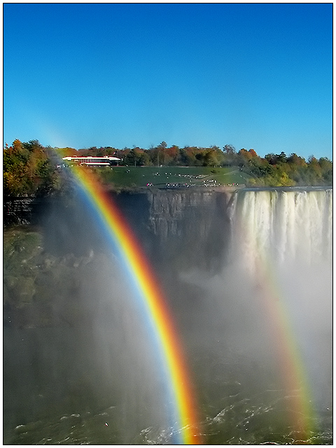
Rotated, cropped, curves, levels, a little selective colour play to 'pop' the arco-iris. Neat Imaged aggresively, et voila.
Might be too pedestrian for the DPC, considering there's probably an Icelander or two entered in this one...but I was missing my update button last week. DPC is damn addictive.
post-
Very nice, my 2nd highest. Thanks for all the really great comments. Plus, I can now brag that I outscored Judi and Larus in a challenge. Take that!
Statistics
Place: 11 out of 93 Avg (all users): 6.6368 Avg (commenters): 7.5000 Avg (participants): 6.6170 Avg (non-participants): 6.6429 Views since voting: 3164 Views during voting: 450 Votes: 201 Comments: 23 Favorites: 0
This took me a little while to "get" it, but it is such a strong composition and is so beautiful that I just kept staring...I love the positioning of the horizon and the deep blue sky providing balance. Great job. PS, I voted a 9 on this a couple of days ago and I'm just now commenting....
The rainbows stand out very well indeed - I think overall there is a slight lack of sharpness (being picky here) which might be caused by focusing on the rainbow.
A double rainbow - Very cool stuff! I am not sure about the cropping however. The blue sky at the top seems to take up too much space - the action is where the rainbow is and I would like to see more of it






 Add photograph to your favorites
 Add photographer to your favorites


 Photographer found comment helpful.


