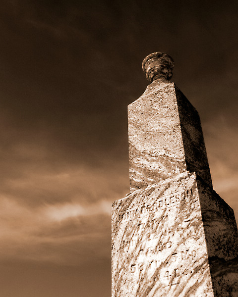
Hits: This is a well composed natural gradient photo. The exposure looks about right. Sharpness is good and there isn't much noise. The overall tones have fine aesthetics.
Misses: Texture is downplayed here in the stone at this angle and with this light. The granite looks is pretty smooth, so it's really the engraving, the overall shape of the stone, and the clouds that represent surface texture here. And the engraving is not even very visible here.
Ideas. Perhaps another source of light from an assistant angled onto the stone would have brought out the engraving. I think a perspective shift might have made it more dynamic as well: perhaps you could have captured the stone angling on the diagonal of the shot, with an even sharper perspective. Or found a stone with a broken off area so an unsmoothed area of the granite were visible.
Very nice shot. Contrast of the marble to the sky is well done. Since this is a 'Texture' challenge, you may actually need to be closer to the marble to fit better.
Good composition - very strong on graphic elements. The light is too harsh, too directional to promote a sense of texture though - simply enough, with the inscription being barely distinct you're harly likely to have captured a feel of the surfces of that stone.





 Add photograph to your favorites
 Add photographer to your favorites

 Photographer found comment helpful.


