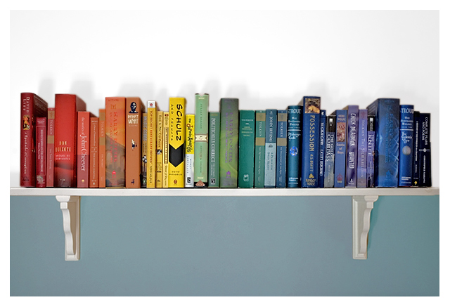
I voted an 8 on this a couple of days ago, but now that I'm back to comment, this really deserves better. I typically don't like dividing photos in the center like this, but because the wall is a different color top/bottom, it really works well. Of course the idea is totally awesome and now I can't get the Reading Rainbow song out of my head! bumping to 10 and my blue :)
Nice. Couple of things to bear in mind - the shadows above the books are not especially attractive and in general this lacks a little bit of sharpness.
The idea is a good one, but needs a little more attention to pull it off entirely successfully. Personally, I would prefer to see more negative space to the top of the frame and a rather tighter framing to the sides, so that the ends of the shelf aren't visible. the shadows are somewhat distracting, but I can't give you any practical advice here, as I am a complete ingnoramous as far as artificial lighting goes.
such a great idea - love the theme, love the composition, love the color set up. the only thing that is on the down side for this is the lighting - the shadows above the books really distract and cost it a point or two from me
Hey, this is cool - a "novel" idea :-D I like the composition and lighting. If anything, I wish the shadows behind the books were either stronger or not there altogether.






 Add photograph to your favorites
 Add photographer to your favorites

 Photographer found comment helpful.


