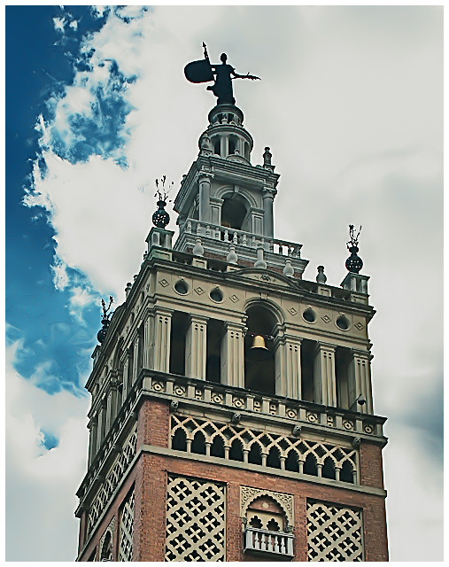
Okay......bear with me, I'm trying to learn how to leave carefully constructive comments. The contrast between the entire structure being visible *except* the way that the guardian is shrouded in shadow is disconcerting to me. I would like to see more definition on the guardian, or less on the steeple/tower. Perhaps angled as someone else suggested, or perhaps less of the steeple/tower below it. I agree that the colors seem a tad off.
What an interesting building and guardian. It's amazing that "they" put these wonderful statues so high up that all you ever see are there silhouettes.
I like the PP, the building almost seems superimposed on the sky. I might have skued the building even more to add some contrast to the strong horizontal and vertical lines of the building.
Charlene - I love the sky in this. It has such a beautiful swirly blend. Looks like a beautiful building with all the variety in construction. And I personally like the processing.
Midtones seem a little flat, giving the whole image a greyed out, undercontrasted feel. I'm not sure if that's what you were after, but I think it detracts from the image somewhat.





 Add photograph to your favorites
 Add photographer to your favorites


 Photographer found comment helpful.


