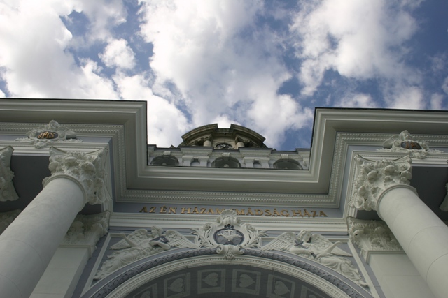
I'd prefer if the horizontal line were straight, and not on an angle. Also, including more of the building to have a more dramatic shift "up" would give it more punch.
Great location and sky. The image is rather flat though. I'd have worked with selective colours (if you have photoshop) to bring out the blues and whites more.
OK, you have probably heard this already, but this would of been a lot better had you straightened it (legal in basic editing) Also, adding a bit of contrast would of improved the overall feel of the shot. 5
I like the clear black line dividing the building from the sky. I also like the symmetry. Just a slight rotation so the lines are parallel horizontally and then a crop would have made the impact greater. Good job overall though






 Add photograph to your favorites
 Add photographer to your favorites


