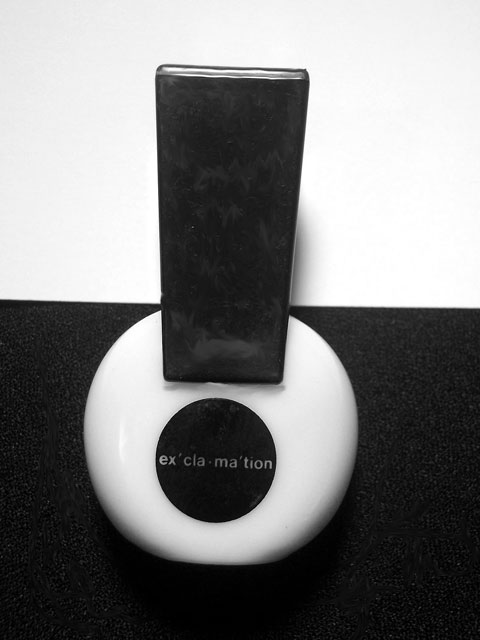
I like the graphic nature of the shot. B&W subjects done very simply. I really like the tilted composition gives it that yinyang feeling.Gave you the "9"
I look at this and think of all kinds of possibilities. Not that you didn't do a good job. All of the parts are so simple and interesting. Two black rectangles and two circles. I would love to see some more shots if you experiment with the composition and lighting.
First thing I notice is that the 'horizon' line is tilted, not usually a good thing unless it's an extreme angle or for a set mood. Seconly the lighting seems a little dull. The white is white, but it's not too bright, which is what you normally see in product shots like this. What light reflections there are are placed well and not too strong. This also looks like you placed the item flat on the background as there is 'texture' in the black nearer the top. I'm guessing you did that to reduce shadow, but sometimes shadow can be a good thing to add dimension and depth to an image.
For a picture like this to work for me, the perspective has to be spot on, all lines as horizontal or vertical a can be. Increasing the contrast would help, too!
Nice composition. Focus seems to be slightly off however. Also, the bottom portion of the frame does seem to be every so slightly underlit or underexposed.






 Add photograph to your favorites
 Add photographer to your favorites

 Photographer found comment helpful.


