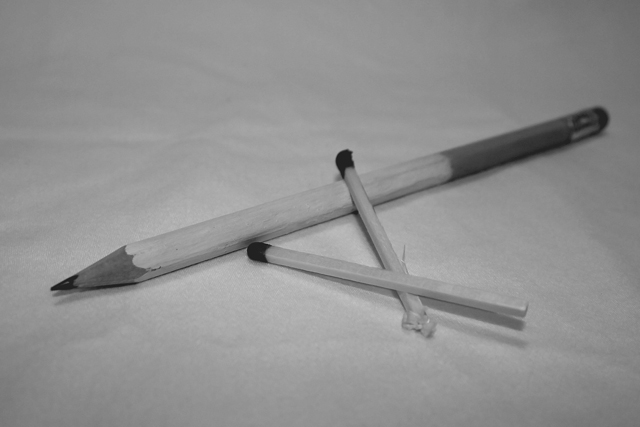
yeah...smoking is bad for your health...need i say more...wish i could have done this better...i felt kinda rushed, and i had other ideas for the pencil that didn't work out...
Statistics
Place: 105 out of 112 Avg (all users): 4.4536 Avg (commenters): 3.3750 Avg (participants): 4.0000 Avg (non-participants): 4.5962 Views since voting: 972 Views during voting: 416 Votes: 280 Comments: 18 Favorites: 0
I know you can do better than this, because I've seen some of your other work. The whole image seems a bit gray. I think a levels adjustment might help. I like your message. It deserves a bit more effort.
I like the idea, but yeah, the lighting and low contrast don't help it. You could use this as a processing exercise - see what you can do about the contrast and sharpness.
I don't quite get this --- if you are going for a cigarette feel, I would have added some smoke coming out of the pencil. A bit more contrast would have helped too (the image is a bit flat)and would have made those darks stand out more.
your title might go better if you had a cig box in the shot as well. I am assuming that by "cancer stick" you are talking about cigarrettes, but the pencil does not really convey that.
I like your idea. The colors and gray areas seem a little flat to me. Perhaps if there was more contast or if the pencil was in an ash tray, I would have scored it higher.





 Add photograph to your favorites
 Add photographer to your favorites

 Photographer found comment helpful.


