Author Thread Comments Made During the Challenge
Post actions
its nice but i think its just too blurry. maybe thats just me. kinda hurts my eyes.
Post actions
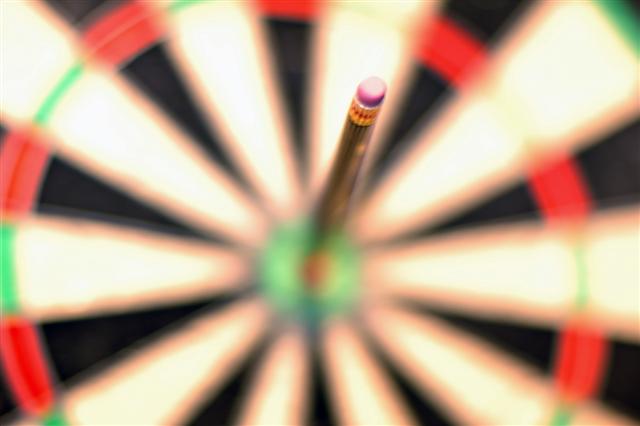
I like the soft tones of this shot a lot, but I feel like I'd like to see a little more of the pencil in better focus. Overall, I like the shallow DOF, but this shot would have some serious POP to it if the eraser was solidly in crisp detail.
Post actions
this gets a 10 from me
Post actions
Way too out of focus, but the idea works.
Post actions
Maybe sharper focus on the tip of the eraser
Post actions
not sure about the title...I think of a dart
Post actions
~
Post actions
Post actions
The dof is kinda off... would have definitely liked more focus on the point of contact..
Post actions
This could of been pretty good, however, there is no focus anywhere in the shot. pity really. 5
Post actions
Nice idea - but I wish something was in focus
Post actions
Shallow depth of field still needs a focal point
Post actions
Color looks to be off a bit. I would like to see at least part of the pencil in foucs. It looks like the entire photo is just "out of focus".
Post actions
The focusing is way way too shallow...
Post actions
Unfortunately, nothing in the photo is in focus.
Post actions
Nice concept, just a bit too blurred for my liking.
Post actions
This seems overexposed to me.
Post actions
Just too blurry...nothing looks sharp. Not a bad idea though (just like mine;)
Post actions
Duh, I don't get it. focus sucks. a good photo grabs you. this one loses me. 2.
Post actions
I like your idea. For me, if there was more focus on the pencil or having "feathers" on the "dart", I would have scored it higher.
Post actions
nice DOF, although I think you've oversoftened it a bit
Post actions
Most of this shot is out of focus
Post actions
Post actions
Not enough in focus IMHO. 5
Post actions
Ahhh...groovy comes to mind! Love your totally, cool image. The colors and DOF work so well with this wild image! Love it.
Post actions
For me everything is way to out of focus, in fact, at least at this resolution, it doesn't look like anything is in focus. I like the shot, but I would like to see more of the board the pencil is stuck in.
Post actions
Nice... kinda like an abstract but also very recognizable too.
Post actions
Great idea, just a little "too" out of focus for the "impact" though IMO





 Add photograph to your favorites
 Add photographer to your favorites


