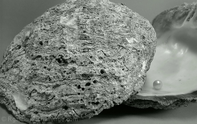
I've always been fascinated with contrasts in nature, like the rocky surface of a nacre shell and it's smooth silky insides. I borrowed the shells from a friend and took several shots in diverse angles and lighting conditions. This is the one I liked the most. I cropped it, changed it to Black and White, Neat Imaged it and resized it for submission.
Statistics
Place: 93 out of 406 Avg (all users): 5.6810 Avg (commenters): 6.0000 Avg (participants): 5.4444 Avg (non-participants): 6.0556 Views since voting: 1238 Votes: 279 Comments: 18 Favorites: 0
I think the shell in front [and yes I realize it's showing the texture] could of been placed better. I think we see too much of it. With these two reversed we'd of still seen plenty of texture. Composition. You did well on lighting, tones and focus. Good luck in the challenge.
There's a 1970's low-contrast feel to this - quite interesting. Certainly captured the texture of the outside, but the pearl and the inside of the shell seem to have been relegated to almost an insignificant detail. Composition doesn't work for me - perhaps because of the tight crop on the left of the shell and leaving the right side open.






 Add photograph to your favorites
 Add photographer to your favorites


 Photographer found comment helpful.


