Author Thread
Post actions
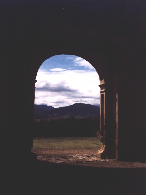
Beautiful. Possibly too much neg space. 7
Comments Made During the Challenge
Post actions
This is like a Rembrandt painting.. Good work!
Post actions
this would be amazing, if the contrast was adjusted...
Post actions
Composition: Subject Placement, Cropping, Background9,
Post actions
That's very beautiful! It looks like an illustration out of a beautiful book of poetry or something like that. I feel a little bit uncomfortable about the framing, but I'm not sure if I would have preferred more negative space or less... hard to say. It's your vision though, and I like it. I'm giving it 10 - lisae
Post actions
Post actions
very nice. looks like it should be a painting.
Post actions
focus seems a bit soft. Blacks a bit washed out.
Post actions
lovely location - perhaps too much of the 'frame' though. Contrast needs some work too.
Post actions
could benefit from some levels adjustments, but a good pic nonetheless
Post actions
Moody! Everything fits together... the mountains are a bit blurred, but that makes it just more special! I love it!
Post actions
Post actions
Post actions
Very nice!! Quite grainy, but the exposure looks good! Would have done great in Negative Space, too! 8 chakkobbo
Post actions
One word...Superb !!!!! Shiiizzzam
Post actions
I know from experience that its tough to capture the still and retain detail in the archway. Nice work. I love the threatening nature of the sky. 7 sjgleah
Post actions
Post actions
Very pretty shot, although I may have preferred more of the scenery and less of the darkness. I love the depth of field on this one.
Post actions
This knocks my socks off!! I like this so much. FIne job, maybe a tad bit dark, but still.......... Score 8 Justine
Post actions
This is a beautiful photograph. Kaz
Post actions
Interesting corner you have there!






 Add photograph to your favorites
 Add photographer to your favorites


