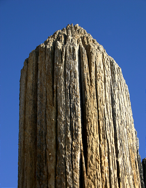
very straightforward presentation of a pretty simple idea: not necessarily a bad thing, but it is lacking a touch of inspiration i think. Perhaps it might have been a touch more successful with some sense of location, though you have attained some degree of a sense of texture with the shot.
Oh, I love the texture in this fence post. It may be that you sharpened it a bit much (or maybe not); it's a good example of the play of lights and darks against a good complementary background.
This was an idea I was going to go with but I found it to be a little to plain for me. I like the way you used the sky as your background but IMHO I think the sun is a little to much on the right side.







 Add photograph to your favorites
 Add photographer to your favorites


