Thank you all so much. Alot of comments on the color....I needed to de-saturate it a bit to compensate for the redness in her face. And the scarf was hiding where the pencils were poking her in the neck. WoooHooo thanks again'!!!
Yes....I had to much time on my hands today. Yes I know...it is a bit wierd. This picture was difficult because her skin was a bit blotchy so I wanted to reduce the noise to give it a more smooth look yet keeping the pencils sharp. I wish this were advance editing. I tried my best to find a balance between the skin and the pencils. I know the pencil are a bit soft.....I think that will hurt the overall score. But a fun project to work on with the kids.
RAW conversion
Sharpen
crop
adjusted shadows and highlights
adjusted color balance
unsharp mask
noise reduction
added border
save for web
Statistics
Place: 1 out of 112 Avg (all users): 7.0297 Avg (commenters): 8.0000 Avg (participants): 6.6232 Avg (non-participants): 7.1496 Views since voting: 10751 Views during voting: 798 Votes: 303 Comments: 86 Favorites: 6 (view)
I think you got the balance between the skin and the pencils down to a "T". It's a beautiful, creative image and she's a lovely girl. Congratulations on your blue ribbon.
Oh how I am so not surprised to see this one with its ribbon under it! I love it when the voters get it so right! CONGRATULATIONS. What a gorgeous little girl and such a creative display of the challenge!
This is one that we will only see once in this challenge. It is nice to see something outside the box. You can only stomach so many chopsticks. Did you take the time to arrange the colours or did you just start glueing them on?
Your model is lovley and her Big Blue Eyes are wonderful. I like the movement in her hair and the lighting set up as well.
I can tell that you put a lot of energy into this one; and it paid off. Really nice. Maybe the vest could have been black so as not to show through between the pencils...but it's still one of my faves in this challenge. Super shot!
This is a great portrait -- the light and focus on her face are amazing! I love the idea - very, very creative! I am not too hot about this thing on her neck, it competes a bit with the pencil vest in my opinion.
Super idea and the lighting on the young model is very good. Pity that the pencil vest isn't constructed a little more seamlessly. High marks for originality though.
finally a really good pic in this challenge! I love the idea: very creative! Otherwise it's a beautiful portrait! Very good sharpness and clarity! I wish it in the Top 3!
You have here a beautiful portrait style photo – executed to perfection. Your model is beautiful, and the “vest” idea is great. The one thing that is not so great (actually kind of messy) is the “pencil vest” that you have created.
After all, the theme is Pencil(s), and not “Portrait”, and that is where in my humble opinion, you have dropped the ball. Its always nice to see a beautiful portrait of a beautiful child but with 3 new themes a week, I would have liked to see more attention to the actual theme.
OMGoodness!!! WOW WOW WOW! this is my favorite from the whole challenge! In my opinion, this is the most creative use of the idea and your model is just gorgeous! I think I might have to run out and buy myself one of those vests! haha...Very good job!!
Nicely done. Seems a tad overexposed, on the vest bit anyway, colours a bit cold. Very pretty girl, and those eye's are pinsharp with nice catchlights.
From a portrait perspective, image feels a bit heavy on the bottom. Reckon cropping 5 rows down from her shirt would give it better balance.
Lol - this is great! So creative. It actually took my eyes a split second to recognize the "vest." For me, that's what this challenge is all about. Bravo and good luck! 10
The added wind makes this extra humourous. I'd love to see an extra pencil-ish element here ... maybe if makeup was "penciled" on or maybe eraser barrettes or something. Very cool though. 7




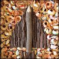

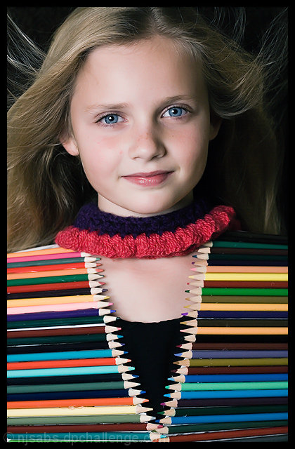
 'Pencil Neck' Vest .......The New Fall Fashion Must Have
 Add photograph to your favorites
 Add photographer to your favorites

 Photographer found comment helpful.


