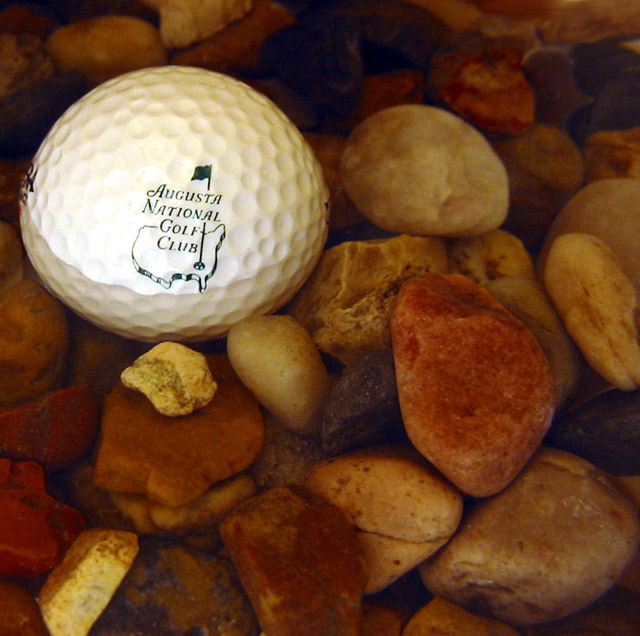
I like the shot overall, but the golf course logo, seems to me out of place. Like you are bragging about actually playing there. IMHO if it was just a regular branded ball or better, just a golf ball this would be more appealing...
TC
a lot to like here - rocks add a smooth, natural contrast to the "foreign" ball. solid composition and framing. to impove this solid entry, I'd suggest changing the water in some way to add more life into the composition (bit stagnent) e.g. bubbles or ripples in the water, flowing water.
Never buy a logo ball, because it's always going to be sucked into the hazard as soon as you hit it. Always ;) Nice inventive shot, maybe a slight orange cast though (tungsten light source?).






 Add photograph to your favorites
 Add photographer to your favorites


 Photographer found comment helpful.


