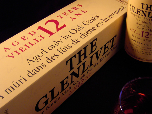
Ah, Glenlivet, my old friend. Very interesting take on the challenge. Not sure what you were going for with the set-up of the composition on this one. Is there a reason you made the box the main subject and not the bottle or the glass?
Smooth is a texture, but you could've shown it better. Having reflections coming from the surface would have shown the it was smooth, although that may be hard or impossible with what you are photographing.
Cute pun in the title. The lighting brings out the smooth texture of the paper well. I'm not sure whether the glass adds to the picture or is simply a distraction, but that may be an element that keeps people looking at the picture.
Great shot for an ad campaign, but the textures in this pic are limited and therefore don't hold much visual interest. Filled glass would have helped if located further in composition.
Good light, and a good capture of a sense of smoothness on the box. Leaving that glass half out of shot seems a poor decision on the face of it, and I can't see what purpose it serves in compositional terms. Kind of dull subject matter, really: without the text, would there be anything to hold the eye?
I`ve got to score this high as it is my favourite whisky....(closely followed by "The Macallan".
Excellent whisky done justice to with an excellent image.
"Slange"
Clever take on the subject matter. I like the composition you have going on here and your exposure is spot on. My eye keeps on going to the upper right hand corner and unfortunately what I see is half a label. I guess in my opinion, either a full label or showing a bit more of the label would help to make the image more complete. I hope this helps.
the glass of scotch is too dark. read of a trick - use a mirror behind it to reflec the light and make it almost glow. the composition seems off too..too much box - the words are all there -too pbvious perhaps..too little bottle, too little too dark a glass





 Add photograph to your favorites
 Add photographer to your favorites

 Photographer found comment helpful.


