Author Thread Comments Made During the Challenge
Post actions
I'm completely lost...
eta: But I keep coming back because I like the patterns and shapes. Such an unusual entry, I can't help but want to bump it up some.
Post actions
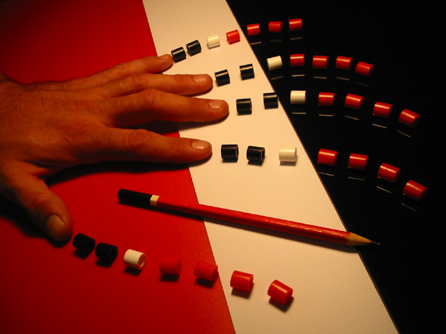
Interesting idea. I am not sure if the hand was needed here, though. It is a bit odd color on my monitor.
Post actions
not sure what's the history here
Post actions
interesting...a little dark
Post actions
Great composition. The loighting and colors could be brighter.
Post actions
the light light and light is the only problem with this picture.. (yes I wrote light three times for emphasize).. This could have been perfect if it weren't for the light..
Post actions
I dont get it.
Post actions
This is one of my favorites in this challenge, and would have got top score from me if the white balance had not been out. Excellent concept though.
Post actions
I'm not sure I quite understand what this one is about. I was thinking maybe if the hand was clucthed so you could not see the actual fingers, but only the beads, and then the pencil could stand in place for one of the fingers, it might work a little better. not sure.
Post actions
Interesting image. I like the forms and colors, but there's something about the lighting that looks a bit...odd to me. I wonder if the middle area is suppose to be white and not yellow?
Post actions
Excellent, enigmatic, a little disturbing.
Post actions
I'm a little lost as to what this is all supposed to mean? Colors seem a little dark. Personally I would like to see a little more contrast.
Post actions
Errrmmmmmm to be honest this doesn't work for me at all, I don't get it? The pencil is just layed down flat on a surface... good luck
Post actions
Post actions
Nifty composition. I think some white balance and level adjustment are needed, though.
Post actions
I'm not sure what this image is meant to be and it's way too dark. sorry.
Post actions
A very interesting image and repitition of the colour theme. Poor lighting. Don't quite get it, but with the right lighting this could be a great visual image.
Post actions
lighting could be better and the idea doesn't really work for me.
Post actions
Post actions
Underexposed. Could you try a different white balance? There is a red cast.
Post actions
Interesting colors and composition. Has a feeling of being underexposed - take a look at the levels /histogram curve if possible. 6
Post actions
interesting composition but the white balance really appears to be off on this one
Post actions
Nice composition - great colour usage! Maybe a little more light?
Post actions
Very cool idea.....wish it were slightly brighter.
Post actions
The color is a little dull and it's under exposed.
Post actions
Post actions
Why are there six fingers? Nice colors in this shot. I really like the contrast.





 Add photograph to your favorites
 Add photographer to your favorites


