Author Thread
Post actions
Comments Made During the Challenge
Post actions
Post actions
I don't get this. Did you submit this by mistake?
Post actions
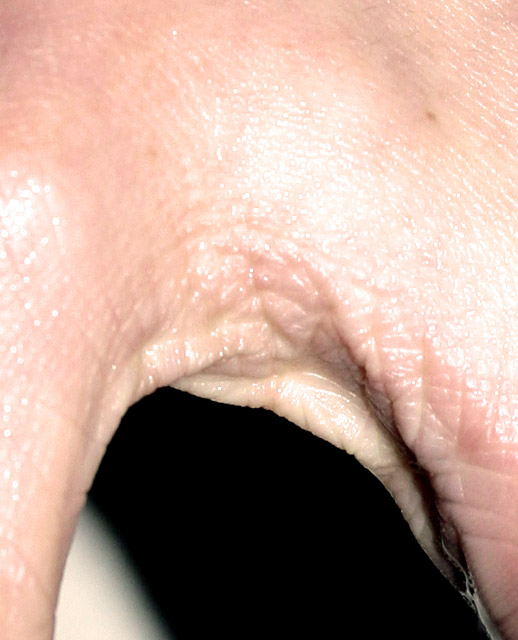
Way too hot... over-exposed skin rarely look good. Most of the "texture" has been blown away with the light.
Post actions
I have to 'hand' it to you! The lighting is to harsh for me, original idea though.
Post actions
Strangely disturbing, and I don't get the title, but it's a nice shot, and it fits the challenge well. 8
Post actions
Interesting crop, but, highlights are overexposed.
Post actions
Weird title, distracting background, too many hot spots.
Post actions
I'm sure you are getting a lot of comments on this shot. Interesting!
Post actions
I really don't get the title???
Post actions
?, not sure is this a hand?
Post actions
This just looks kinda weird. Not sure I'll be able to sleep tonight.
Post actions
looks like a hand - quite badly exposed too. try a faster shutter speed.
Post actions
Post actions
Too much flesh in the upper parts, and too much highlight (flash?)
Post actions
Post actions
Difficult to distinguish the subject.....and how it relates to texture..... the black and white background is confusing.....
Post actions
Hmmm...texture is there and that's all. LIghting is harsh, subject is lost on me and white in the background looks accidental.
Post actions
Post actions
Interesting composition and idea. :) Overexposure/hotspots detracts from image and shading for texture. Focus could have been better as well.
Post actions
Post actions
Front light tends to blow up textures as we can see here. Use lateral 45 or 90 degrees.
Post actions
Seriously ugly! :-) Way too much flash, completely killing any ambient light. White stripe in background an odd touch. properly lit the conjunction of thumb and finger could be interesting - like this, well poor work, I'm afraid.
Post actions
I applaud you for thinking outside of the box, on this, but I think bw would have helped to emphasize the texture more.
Post actions
I don't get your title with this photo. Great cature of skin texture, but lighting is a tad bright.
Post actions
you're title is awful man, and well...the photo isn't good either...





 Add photograph to your favorites
 Add photographer to your favorites


