This is potentially a brilliant image - such a shame that you've submitted it so small. For another time remember that you have 640 pixels and it is best to use them.
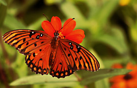
I think this image loses something by resizing so small. There doesn't appear to be enough colour contrast between the flower and the butterfly. However, it is well-composed.
I'm sure everyone is bagging you about the size of the dimensions used here. All I will say on that is set your longest dimension, in this case the width to 640 in your editing software. The butterfly itself looks to be over saturated to the point where you have lost detail that would have helped even a small photograph like this one. Nice DOF though.
Very pretty. The thing to note about reds, is that they can "strain" the eye when you're looking at them. That being said, I like how both the butterfly and the flower jump out at you. The tone of both the red and green appear to be equal.





 Add photograph to your favorites
 Add photographer to your favorites


 Photographer found comment helpful.


