Author Thread
Post actions
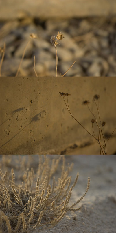
what a cool triptych. Interesting to see the final results below, you got a good handle on that acid tone :)
Post actions
remarkable how well these uncropped photos fit together.
Post actions
ok, beige. that's better. you're off probation.
Post actions
Very cool study of texture and color. I like the vertical orientation.
Post actions
What a neat triptych. And the beige suits your surroundings with all of the sand. VERY COOL
Post actions
Post actions
This is really nice - variation on subtleness.
Post actions
Post actions
Ok, I won't comment and just enjoy this wonderful photo.
Post actions
Don't think of it as beige so much as "natural platinum". If those were platinum prints you'd be paying a fortune for them. 8) Actually, beige is one of my favorite overlays as it drabs down and intensifies a lot of colors. (Don't know if that makes much sense. That Flowers Original has some cool textures in it. Try it as an overlay.
Post actions
I really love how you composed this one yogether, and it does deserve comments.....Perfect.....




 Add photograph to your favorites
 Add photographer to your favorites


 Photographer found comment helpful.


