Author Thread Comments Made During the Challenge
Post actions
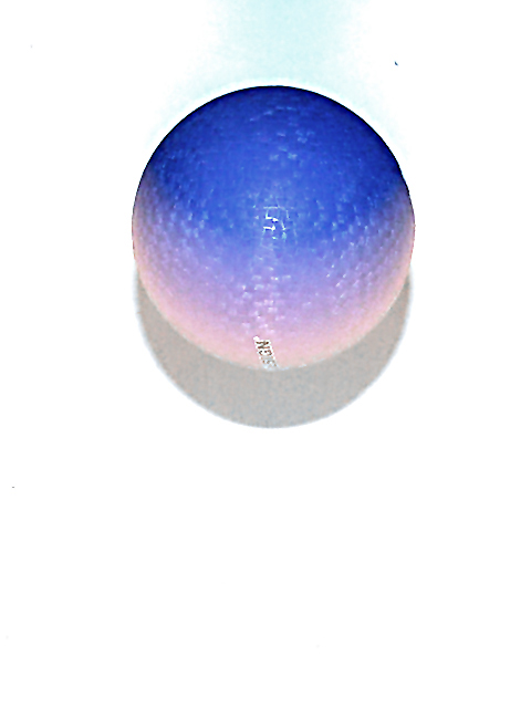
A bit pixelated, I don't like that you can see some text on it, but not all of it. I don't like the blue trail at the top.
Post actions
It's an awful cool picture. I can't wait to hear about it!. 8
Post actions
the letters on your sphere are quite distracting, otherwise this would be quite nice
Post actions
Great color, clever idea, and nice use of negative space. Outside of DPC, I'd erase that distracting dark speck in the upper right. (I didn't take off for it in the score.)
Post actions
interesting color but what is that extra dirt on the upper right? The shadow looks a bit grainish, is this a crop?
Post actions
the teeny bit of blue-green above the ball really adds a lot. nice shot, real pretty. subject matter isn't crazy compelling, but i can see it in a magazine, probably sell a lot of balls.
Post actions
I like the colors and overexposure (?) on this. Nicely done, I think. karmat
Post actions
Wierd colors on what I think is a golfball. The shadow has wierd bumpy things in it. 4
Post actions
neat. cant wait to see how you did the lighting. looks over compressed tho. your pic can be 150K and you only used 94. mag99
Post actions
Composition: 5
Post actions
Doesn't look like it's falling to me. Focus if funky. Text on ball, no likee. - bamaster
Post actions
something doesn't seem right about this photo
Post actions
Post actions
Lost me with this...?? OOF
Post actions
Great job meeting a difficult challenge. I'd rotate that ball a bit to get rid of the label, though.





 Add photograph to your favorites
 Add photographer to your favorites


