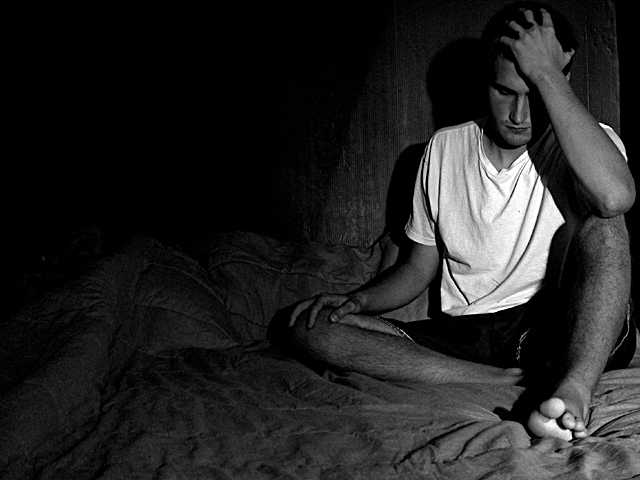
I had this as an idea in my head all week, but didn't have the time to do it well. So in the little time I had Sat. night I took this shot. Its not as strong as I would have liked, but its good enough.
Statistics
Place: 26 out of 218 Avg (all users): 6.3491 Avg (commenters): 8.0000 Avg (participants): 6.3810 Avg (non-participants): 6.3216 Views since voting: 2034 Votes: 318 Comments: 38 Favorites: 5 (view)
This reminds me of photos a friend of mine has taken/published. I like the way you kept some detail in the quilt (comforter? is that another "layer of meaning" in this photo?) all the way to the left edge. If you're interested, I'll send you a link to his photos...if we allowed dodge/burn functions I'd darken that spot at the base of the big toe...with that change I'd love to see it printed on matte-finish paper.
Wow, this is one of the most powerful photos I have seen in a long time. I don't know if this is set up or not but it doesn't really. The white t-shirt and facial expression set against the blackness is very impactful. Very very well done. If there was an 11 I would give it to you.
Very, very powerful photo. I love the way you used the space to basically represent the man's mind, and maybe his isolation from other people (I always feel that when I'm truly depressed all the connections between me and other people kind of melt away). I just really want to give that guy a hug! 10 from me - lisae
Powerful image. I like how you have lit this. It really shows the darkness of depression contrasted with the brightness we strive for. nice work. karmat
title needn't be overt, photo does the talking. real sweet, posed? way up there in the nines. negetive space and subject are relating to each other in a big fat way.
This photo is very thought provoking. I like your use of the negative space. With the rumpled look of the bed, to me, it appears that there is another person under the covers and he's leaning up against he/she. Thus, possibly that person being the reason for his distress. The only thing I had problem with was the shadow. Very good...I really like it.
I think this would have been better if the background were not so lit. The expression and body language are really good. I like the B/W decision. I like the bright spot on the bottom of the foot -- it adds balance and draws the eye south. 5, just-married






 Add photograph to your favorites
 Add photographer to your favorites


 Photographer found comment helpful.


