Author Thread
Post actions
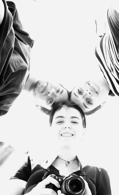
i think the girl's camera is the best part of the photo since it gives the mirror effect of the photography vs. the photographed
Comments Made During the Challenge
Post actions
Post actions
I like this perspective (I do this with bridal parties), and I don't mind the blown highlights here. I don't know how it would look in print, but I like the shot here. I would've gotten rid of the camera on the bottom, though (distracting).
Post actions
it look a waaaaay over exposed
Post actions
OK, the blown highlight work well here. Good idea, very fun picture, I'd expect this to finish quite well.. 7
Post actions
Like the HiPass treatment
Post actions
Neat idea and technique. Sorry, it doesn't do it for me. The camera she's holding is distracting. Maybe a tighter cropping of just the 3 heads would do better.
Post actions
I really like the composition. The deliberate overexposure to wash out background is overdone.
Post actions
too blown out for my taste, realize it was probably done for effect, but do not like it personally, so 5
Post actions
Post actions
A bit washed out but maybe just enough detail. Good choice to go B&W. Is that Jupiter in by her right shoulder?
Post actions
Post actions
Unusual perspective and high-key treatment work to make this more interesting.
Post actions
Post actions
Too harsh for my liking. Cool shot anyway!
Post actions
extremely over exposed to no effect imho
Post actions
Nice composition, but would have been stronger if cropped square imo. Furthermore, a big part of your pic is blown out. This can in some case be functional, but here it destroys the form of the faces, which I wouldn't like to see in a portrait (4)
Post actions
nice idea, not sure about the camera, it breaks the symmetry
Post actions
I like the high key white. gives a sense of I don't know, waking.
Post actions
I don't really like the high key look here. I don't understand t(h)e title. Otherwise a nice, creative picture.
Post actions
Appears very blown-out, otherwise it would have been good.
Post actions
over exposed - too bad it's a cute shot
Post actions
I like the high key you've used here, it works for me.
Post actions
different..prpbably a bit too blown out for my liking but that is only my opinion
Post actions
I like the composition of the shot, but the exposure is not to my liking.
Post actions
I like the high key, POV os good too.
Post actions
Nice shot. I like the lighting, though I would've voted it higher if you had cropped out the camera. It distracts from the rest of the shot.
Post actions
Cute high key. I think it would work better if the camera were not in the shot or ALL of them were holding cameras.






 Add photograph to your favorites
 Add photographer to your favorites

 Photographer found comment helpful.


