Author Thread Comments Made During the Challenge
Post actions
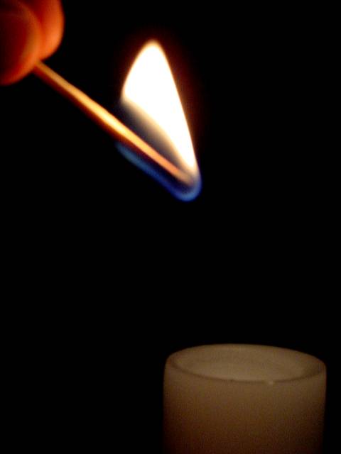
Very nice - I like how you've captured the colors of the match flame and fingers holding the match.
Post actions
How about just the match - the candle is actually extraneous here.
Post actions
Post actions
Great idea. I might have put a small light spot on the candle, to bring it out, as the very bright match really overpowers it. Use of DOF is good to imply perspective to the candle.
Post actions
I think a shot without the fingers in it would really make this stand out more.
Post actions
one of the best I have seen for this 'theme'
Post actions
Apologies for not leaving a proper comment. Please email me if you'd really like one. I’ve voted this image a 6. Kavey
Post actions
just something missing... hmm.. I think you should have used a more interesting candle.
Post actions
The finger, what is that about? It'd be better if it's not in the photo. Also, there is nothing "negative" about the sapce, as the viewer is inexplicably drawn from the fire to the candle.
Post actions
Post actions
Post actions
Composition: 5Lighting: good 5,
Post actions
I like the upper part a lot but I think the bottom part is 'weak' compare to the top. 6
Post actions
Post actions
This is a good idea. I like the flame, but the shot doesn't really do anything for me. Great lighting effect. 6
Post actions
very cool use of - space :)
Post actions
nice simple image with one strong element. Good luck in the challenge...it's a tough one! Grayce aka Gracious
Post actions
I think the other match photo is better taken (you can see the shape and colour of the flame, and the focus is better).
Post actions
Nice idea, would of left the candle out totally. Still I score this a 6, good work. Justine.






 Add photograph to your favorites
 Add photographer to your favorites


