First let me thank everyone for taking the time to comment.
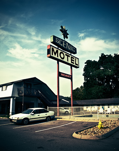
For those who were disappointed by the car, my aim was not to replicate the past at all.
This scene was all happen chance, a drive by if you will...saw it, pulled over, got out and snapped a few...carried on. I've always loved this sign, it's so anti plastic. I didn't want to stick around too long because I was making the residents nervous with my camera. The motel is almost strictly populated by immigrant workers. I didn't dare turn my camera their way, not because I was afraid of them, but I didn't want to exploit them, my presence was discomfort enough. I loved how they were drying their laundry on the handrails, how many were sitting outside in the walkways trying to escape the heat inside, enjoying a leisurely day off.
I suppose at this small size some detail, like the flat tire on the offending car was not noticed. I was not trying to invoke the mid century at all, I was not trying to replicate a postcard. My purpose with this processing, a rather simple "curves" adjustment, was to add a harshness, a garishness to the entire situation. People live here, and the hard truth is, most likely, it's a better place than where they moved from. This place is quite possibly somebody's shangri-la.
Statistics
Place: 452 out of 503 Avg (all users): 5.0250 Avg (commenters): 6.0000 Avg (participants): 5.1429 Avg (non-participants): 4.6552 Views since voting: 908 Views during voting: 174 Votes: 120 Comments: 15 Favorites: 2 (view)
Reminds me of where we used to vacation when I was a kid =) I don't care for the photo so much, but because it brought back some good memories, I will give it a 6.
Your image brought back old family vacation memories. Perhaps if taken from a different angle - higher or from the ground up, it would be more interesting.
The processing for this treatment is spot on. I just LOVE the yellow hydrant in the front. My only beef and you probably couldn't control it, is the two cares, without them it would have been a bit more 'retro' in feel, the cars are just a bit too 'modern' for me. Good luck.
Low vote, lighting could improve this photo, a better defined subject as well (guessing its hotel sign). The car is distracting and doesn't fit the timeline sense of the picture ( the sign and feel is saying 60s/70s), 80s car in 90's era... if that makes sense







 Add photograph to your favorites
 Add photographer to your favorites

 Photographer found comment helpful.


