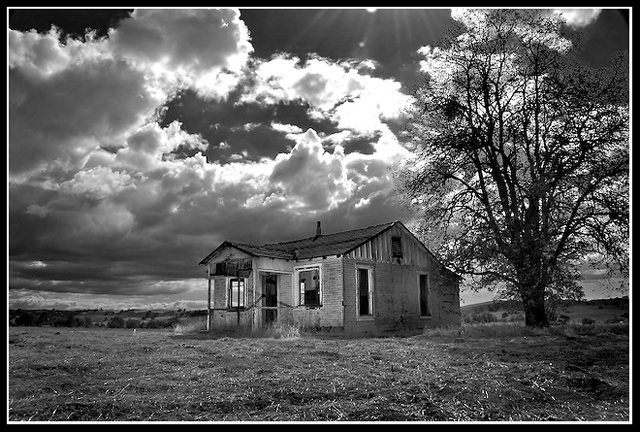
Super location, love a good wreck. I think you might have been trying to portray more than you did. With two clear subjects in the image, the house and the tree, I think is distracting. The tree strands out more than the house, which I think should have been the bigger focus.
I'm wondering how you'd feel about the image if you cropped about 1/4 of the left and right - the tree would still be in the image, but not all of it and we could concentrate our eyes on the buidling and the light coming through the clouds.
I really like the B&W conversion, ground, the shack, the tree, and most of the sky. The only problem for me is the sky directly above the shack.
The sunbeams appear to be drawn on, above a burnt out cloud ?
To be honest these are relatively minor points and it is still a very pleasing picture - the real issue is that the whiteness of the burnt out cloud lifts the eye up and away from where the focal point should be - the shack.
Tone down the cloud, lose the sunbeams and this would be even better





 Add photograph to your favorites
 Add photographer to your favorites


 Photographer found comment helpful.


