I just came across this.
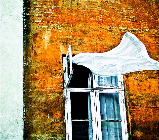
I like the inclusion of the white wall in the frame - it provides a balance or echo for the white lines of the window frame.
I like the high contrast colours and the wonderful textures - they give a slightly surreal or timeless quality.
The clipping of the curtain doesn't bother me.
I don't agree that NOT clipping would stabilise or reduce energy. But nor do I think that clipping it is a negative.
I really, really like the extreme vibrance of the orange... usually when you pull the saturation up this much, it looks awful. But there is just the perfect amount of variation in the hue of the color, and just enough texture to make this interesting, instead of painful to look at. Then something about the high-contrast, the dash of blue, and the pure white of the curtain.... this is a really fun, powerful image!
Frábær mynd Gunnar. Ég er sammála þér með uppbygginguna, hún er flott svona með hvítu röndinni og skorið af glugganum... Ég væri alveg til í að mála hana á striga, kæmi líklega fallega út..
Thanks for reading my mind, posthumous. Without the white strip of the other house on the left the image loose energy, not the opposite like Rino63 and some other said. I also totally agree with posthumous that cutting the end of the curtain makes the image more powerful. So thanks a lot for your support and kind remarks!
I like the right side of this image, the left side with the big white strip is unhelpful in the image. a better composition was possible if the curtain was entire. the crop is distracting and the image lose energy. probably you have only this image, but a second shot with the window on the left and the curtain that fly should be great. the colours and the tones are beautiful. 6 but this is one of that images that I love
no no no... why crop out the left side and make a simple image even simpler? and if you include the entire curtain in the frame, then you stabilize it, *reduce* the energy.
I like the right side of this image, the left side with the big white strip is unhelpful in the image. a better composition was possible if the curtain was entire. the crop is distracting and the image lose energy. probably you have only this image, but a second shot with the window on the left and the curtain that fly should be great. the colours and the tones are beautiful. 6 but this is one of that images that I love
One of my faves so far! This is awesome. I love the processing...the colors...and that curtain in the wind is phenomenal. Very nice lines and composition as well. 10.
Oh this is fantastic. So unexpected. Love the movement of the curtain, the geometry of the window and the POW of color from the inside curtain and the brick wall. This is like a painting. AWESOME.
I love the colors. composition is a bit off. it should've been more to the right to get the whole curtain and some space in the direction the curtain is blowing.
very interesting capture, though it would IMO have been better to include the whole window in the shot. I like the contrast between the heavily textured wall and the soft, bright curtain. nice complimentary contrast, too.
I really like this shot. Great colors and textures. The flowing curtain gives life to an otherwise desolate feeling image. Probably isnt scoring great for you (or as well as I would like to see it) as it isnt really a DPC friendly image. But I will hopefully help out. 8 for now.






 Add photograph to your favorites
 Add photographer to your favorites

 Photographer found comment helpful.


