I'm not surre what kind of effect you werre going for. To me, it looks like an originally blurry photo with filters added in post-processing to try and enhance it. Sorry.
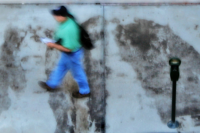
From the thumbnail, I thought it was going to be a blurry pic. Then I open it and I see it's kind of artsy. Love how the grit on the ground creates some kind of depth to the photo. Interesting!
very interesting pp work here leading to a relly good impressionist effect. The only slight distraction for me is the horizontal line right at the top of the picture. Otherwise really good.
Does this photograph hold any interest? The subject(s) are unspectacular, if not trite. The motion blur appears to effect stationary objects. A cyan cast muddies the entire image, bleeding from a crack in the concrete.
The image appears as if divided into three panes, suggested by the cracks outlining the poured concrete of a contemporary sidewalk. The vertical nearly halves the landscape orientation -not quite but just enough to offset any sense of symmetry. The horizontal runs so close to the upper margin it could be mistaken for it, if it were not for the offset vertical which is equally out, by the same margin.
Comparing the distance between the top of subject on the left (the hat) and the top horizontal with the distance between its counterpart on the right (meter foot to bottom margin), we have (suprise!) symmetry. When we accept the presence of the three panes (via perspective as outlined by margin and cracks), it is easy to find the subjects in their traditional third.
This (the tension between the respective orders as much as that between the two unlike subjects) is both subtle and playful enough an order to be enjoyable. The meter, now, appears to have been placed deliberately in this photograph, which might as well be a painting. Its foot, after all, could be made of blown glass, while its eye is as yellow as it is watchful and unblinking.
As it is, the man with the baseball cap must be captured in flight, waving evidence.
Interesting idea, not sure it really came off IMHO. The man & meter doesn't really hold my attention and I don't like the crop to include the walls at the edge of the sidewalk.
Although I have to admit I don't like the picture too much. BUT I recognize and acknowledge that the composition and technique is executed flawlessly. Cutting the picture in half and applying the rule of thirds in each of the halfs is a great ackomplishment. And you know what? Now as I looked longer at it, I start liking it.
Interesting shot, quite artistic. Like the way the blue tones are carried throughout. I wish there was a little more of interest in the shot though but still an interesting image.






 Add photograph to your favorites
 Add photographer to your favorites


 Photographer found comment helpful.


