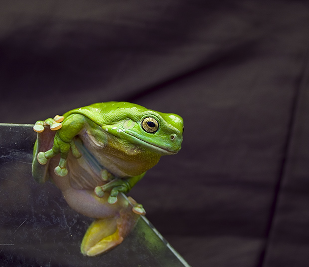
Lol - love the title. the colors on the frog are great - so vivid. The glass is a little dirty and takes away from the frog as does the wrinkly cloth background (at least that what it looks like to me).
I thought the back ground could be made darker so as not to see the wrinkles. The frog is great! I would also suggest cleaning up the glass he is sitting on as well.
good color, good sharpness on the frog. composition is too centered (face exactly in image center), would have cropped off 20% at right and top. wrinkles in backdrop distract, so a tighter crop would have helped that, too.






 Add photograph to your favorites
 Add photographer to your favorites


