Challenge:Negative Space (Classic Editing) Camera:Canon PowerShot S40 Location: Saint Charles, MO (Saint Charles High School) Date: Sep 15, 2002 Aperture: 8 ISO: 200 Shutter: 1/320 Date Uploaded: Sep 15, 2002
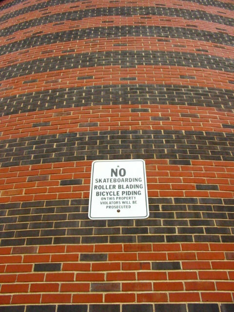
very nice symetry. use of neg space is clear, and pretty cool. looks like a hard shot to get lined up. was it the angle, or was the wall curved? anyway, I really like it, and your lighting, and framing, and focus is great. good luck in the challenge. ~hbunch7187~
the curvature of the wall, however it was achieved... whether by lens or if the wall is actually curved, really make this shot. i didn't catch it at first, but if i scroll up and down it using my mouse wheel it seems to "breathe." great use of negative space. (8) ~mcmurma
Interesting shot... My comment here is regarding the negative space... The wall here being considered negative space is ok, but the support it lends to the sign as the subject isn't what I expected. IMO, negative space should not draw any attention away from your subject... it should support it. In this photo, the wall offers a lot of contrast with the lines, colors, and textures. IMO, this creates competition for viewing time with the subject... - jmsetzler
great idea, great color...I'm only giving this shot a 7 because of the competition, although originally I had it as an 8. Wish the sign was more in focus. - zadore







 Add photograph to your favorites
 Add photographer to your favorites


