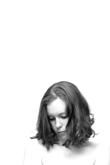
The ever enigmatic title : I liked three shots from this series which I've had printed out and will display in one of those three-panel frames. I've titled the entire series "Three", which is why this one picture carries the same name. I didn't expect so many people to actually care.
Thank you for all of your kind comments. I really like this shot, and the other two that go with it (all done in the same high-key fashion).
I don't get the title...but who cares. This photo is great. I love the look on her face, the angle and framing are good, and the lighting was wonderful. great use of black and white. excelent neg space. good luck in the challenge. ~hbunch7187~
Other than not understanding the title, I like this one. I'm not sure that empty space is necessarily a great use of negative space in this instance, but it's still a nice shot.
I don't really know what to make of the title, but I love this as a portrait. The negative space along with her pose and experession makes her seem subdued and oppressed in some way. There's a definite emotional tension in this image. I love the black and white. 10 - lisae
The lowered eyelids and the expression make this quite an emotive shot, and, to some extent, I think the white space does add to that. I don't like the white blowouts on the skin too much but I do like the BW treatment. 7, Kavey
Beautiful shot. I love the blown out hightlights, some may criticize that but I think it absolutely makes this shot. You've captured her features and expression so well.
Hopefully I'm not the only, but I don't get the title This is such a great photo!!!! She looks young. There's something about this photo, an emotion I just can't express...sort of sad, but not desparately sad. This photo is so soft. As I look, I'm not sure if the amount of neg space is needed for this (I scrolled up to see the photo w/o all of the white), but then it takes on a different effect. The additional neg space emphasizes the emotion - a kind of lonely aspect of the image. I love the way her hair falls. She's very attractive, especially her full lips and cheeks. She has a certain beauty that is natural (although I'm sure she has makeup on) Excellent Photo 10 Ruthann
I don't get the title, but that is neither here nor there. I like the contrast you have here, and the i think the empty space at the top pushes the eyes down to the subject whose eyes lead you further down. (Did that make any sense at all?) Good work. Very emotive, I think. karmat
Great example of a high-key photo. Excellent job of getting the bottom portion to disappear without blowing out her head. I think you could do without quite so much empty space above. There's enuf neg space just around her. 7 ~indigo997
very nice image... I love the starkness of it all... the high key lighting and washout seems to contradict a bit with the expression here.. i'm not sure how they relate.. I would love to hear more about it :) = 9 - jmsetzler
I would not really call this 'negative space'. Don't get me wrong, the picture is great but I would prefer to see the subject a lot more than have her tucked at the bottom of a white abyss. Sorry if this sounds abrubt. I love the bottom half very much. 7. marcvg
congrats for trying something different with the nude. we need more of this. i love the lighting in her face but her torso it's too bright don't u think? u need shadows in her shoulders to define her figure.
Very pretty! She's got that Natalie Merchant thang going on... Mmmm! No apple? Bah! I'll grade on how cute the model is! Yea! Woohoo! Oh that'll make me popular. *sigh* - bamaster (8)
Is this the girl from the shower? I like this image. It bothers me though how she blends into the backgound. If you are just trying to accentuate the face, than the works well. Perhaps I slightly tighte crop would have made me like this style more.
this is a delicate image - really clever - how did you do this without selection tools though? i.e. how is the face well exposed but the shoulders bleached out to nothing?
Why three? I don't get it. Is that the score you want? Is that how many breasts the model has? J/K :) Because you included the shoulders and chest I would have liked there to be more definition in it. Otherwise I like the lighting on the hair and the face.
I like this. Alot! I don't get the title, though. How did you get her face and hair to look so natural, but her shoulders look like you have used a lot of contrast to lighten them? I hope you score high.






 Add photograph to your favorites
 Add photographer to your favorites


