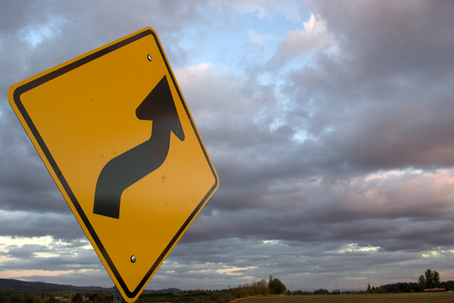
People that commented seemed to be the most negative voters on this one. There is something about the combination of the yello, the blue and the grey in this shot that still appeals to me. Granted, the overall composition could have been more refined, or more "oomph" could have been drawn out of it. But, as I was standing on the side of the road, trying not to fall in the ditch as cars whizzed by closely, I really wasn't worried about all those other things.
So, if you liked it, I am glad. If you did not like it, so be it. As you can tell, there is a bell curve of a response to the photo.
For me a picture of a common road sign has to have other very dramatic or interesting elements to make me vote very high, I mean this is kind of uninteresting and doesn't really have any "pop" to it. 4
Meets the challenge but lacks any oomph. Cropping it so the sign was the same distance from the edge on the top, bottom and left could have helped some, but overall it just doesnt have the wow power needed for me.







 Add photograph to your favorites
 Add photographer to your favorites


 Photographer found comment helpful.