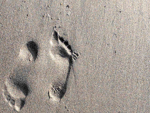
What is Negative Space? The big question this week. Well, not sure I understand it yet, but this is what I came up with. I have some outtakes, too. Were they any better? Follow my link on my profile page.
Statistics
Place: 16 out of 218 Avg (all users): 6.6279 Avg (commenters): 7.8636 Avg (participants): 6.7815 Avg (non-participants): 6.5078 Views since voting: 3184 Votes: 344 Comments: 45 Favorites: 13 (view)
Great shot. I like the way the way the image is molded into the 'negative space'. One of the most original concepts for the challenge, and well done. 9 - chrisab.
Cute! The wit of doing opposite directions is brilliant and creative. NIce texture, meets challenge theme, and nice lighting and shadows. Good luck in the challenge! Grayce aka Gracious
This strangely changes from positive to reverse/ from a hole to a hill - a wonderful picture, I hope others can see what i see, you will do well with it.
I think you should have found an interesting thing on the beach, like a shell, or some interesting patterns in the colour of the sand. Here the sand is just the medium the footprint is in, and doesnt hold any interest in the way other shots using patterns, vivid colours and strong contrasts do.
very nice :) I really like the negative space here... the indententations in the sand could be considered negative space in themselves... excellent :) - jmsetzler
I really like this image, it is one of my favorites for this challenge. I think that it demonstrates creative thinking. In addition, it is a very good exposure and well composed.
UPDATE: Sorry for the long pause. Busy week! There's a lot I like about this photo. The clever element of the feel opposite each other in direction is really great for drawing attention and pulling you into the photo. The shadows int he footprints are nice, quite natural. The texture of the same is interesting and somewhat calming. (LOL, but true). The sepia tone is nice.
The left foot seems to crowd the edge of the photo a bit, but that's a nitpick. 7, just-married
ORIGINAL COMMENT: Neat idea. I like it. 6-7, just-married
Right on the challenge here.......well done. Maybe a bit too bright, over exposed some. Still this is good, and speaks loudly. Good luck. Score 7 Justine
I really like this. Maybe it is just me, but it appears that the footprints are raised instead of "imprinted" in the sand. If so, how did you do this? Definitely one of my favorites.
Composition: Good but not wow, looks better in the thumbnail 6 Lighting: to bright not enough contrast between positive and negative 5, Appeal: 6, Total Rating 6 Sulamk






 Add photograph to your favorites
 Add photographer to your favorites


 Photographer found comment helpful.


