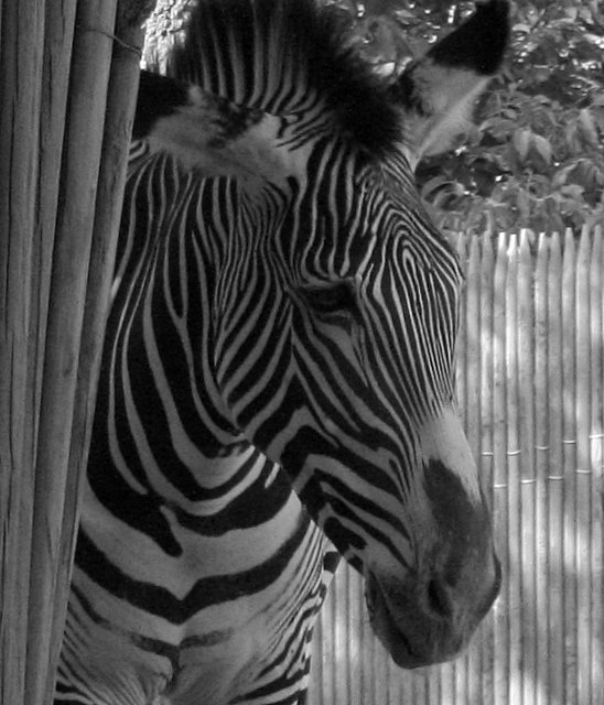
I agree with the other commentors that some additional contrast would greatly improve this otherwise wonderfull shot. I think even if you didn't want to take time to dodge/burn the individual stripes that a simple tonal curve would help.
Neat lines! I think a little more contrast or maybe a little dodging of his white stripes would've made him stand out that much more. Nice composition though, he almost looks sad!
I agree with the previous comments about boosting the contrast and a perhaps a bit of USM. Apart from that this is a really nice capture. I love the stripes!
The expression on the Zebra's "face" has a sad quality to it. A title like "Don't fence me in", or "I want to go home", would fit quite well (not that yours doesn't). :P
Certainly is a lot of stripes going on here. :) Hope you had a fun outing!





 Add photograph to your favorites
 Add photographer to your favorites


 Photographer found comment helpful.


