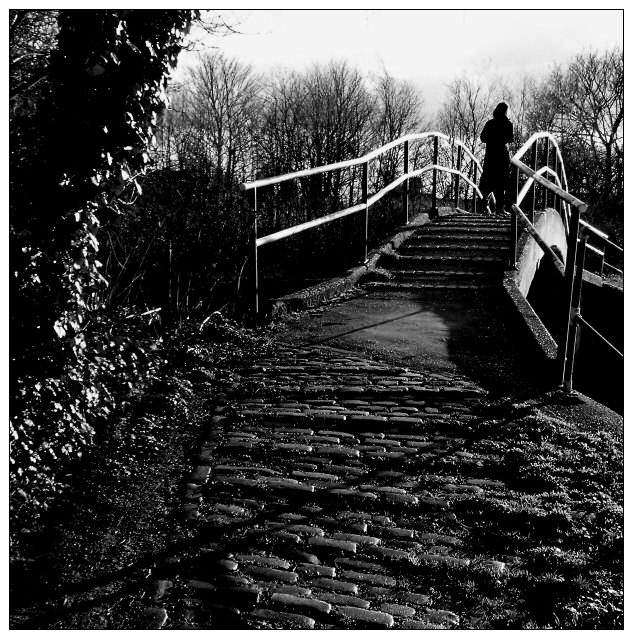
This is taken very close to the propsed site of the Olympic Stadium should London win the bid for 2012 ... in the strange world of the Bow Back Rivers, a kind of post-Victorian-Industrial wasteland very close to my home, and one of my favourite subjects these days (see the 'desolation' entry). A few years back there was an attempt to make the area into a walking/recreational/wildlife reserve, but that foundered on paucity of funding, leaving a pecualiar wilderness of river-side paths and knackered old factories. Great territory.
Photographically, 'leading lines' is the trick here - this is what allows the subject to be a touch too far out of frame for the rigid compositionalists. I wanted to capture something of the idea of departure, thus the enormous amount of fore-ground: that that allowed me to use those shadows to extend the lines of the bridge, and to bring those lines back together, is purely fortunate.
Contrast and aspect ratio owe a great deal to the work of m. Beguin, though I'm not quite sure this has the lyricism of location he would find.
Statistics
Place: 10 out of 188 Avg (all users): 6.2667 Avg (commenters): 7.4167 Avg (participants): 6.0099 Avg (non-participants): 6.4201 Views since voting: 1832 Votes: 270 Comments: 30 Favorites: 4 (view)
the bridge is so spiderlike
the figure is so dark
the texture of the brick
and long shadows
bring hope rather than despair in her departure;
I guess when you leave somewhere you arrive somewhere else.
This is one of those shots that I can not just sit down and write up a critique for. Each time I look at it I pick up a little more than the last time. I see another subtle nuance. This, to me, is a sign of a very good, if not great, piece!
My very first impression was that this was overly sharp and too contrasty. After a moment I realized that you have attained an almost surreal feeling with this combination. My next thought was that the darks are too dark and the highlights are too light, but again after a moment I realize that this all combines to give the overall feeling of moving from the here and now to the beyond.
Your foreground is very crisp and clear. The horizontal lines of the brick path give it a very 'base' feel, like a starting point. The rest of the lines lead your eye up and over the bridge into the unknown. You've accentuated this feeling with the very dark background and the very light lines of the bridge. This gives the bridge a feeling of a transition from the base or now into the unknown and shady future.
All in all a very compelling photo which implies a story. You don't know the details of the story, but you know that there is a change in it.
Still my favorite so it's going in my favorite. Outstanding photo. I think it should have placed higher, though top ten is nothing to complain about. Seems it's no coincidence I thought this was JJBeguin's!
The hot handrails on the bridge are totally distracting. Good theme to this picture, but I think its a little too dark and maybe a little oversharpened. Something just doesn't seem right here.
I really like this image, especially in b&w. Looks like a scene from an old '40s movie. She's leaving, but somehow, before the end of the movie, they're going to get back together! Wish the rails weren't blown out but that's a nit. Gave this an 8
A lot of emotion comes through in this image. I like the use of B&W. The only thing I would wish for here would be a little less contrast...a cloudy or over cast day would have made this perfect..IMHO:) 9
I find the lighting a little harsh and contrast a little high but I do like the content very much, and part of that is the shadows thrown by that strong light. The texture of the cobbles is wonderful.
My vote for the blue ribbon. Great metaphor here. The high contrast, lighting, and use of b&w all contribute to a theme of letting go and crossing over to the other side. Well done!
I like this shot...it's emotionally charged. I think the light/...and or levels/gamma could of been adjusted to improve the balance. Good entry...best of luck.
I get your idea. But to me, I think i would enjoy your image if you show some sense of motion for the person. If she seems a tad stationary. Also, I think that your image is a tad dark, lighten up a big would help, as i think you lost some detail.
The B&W is perfect, really fits with the look of the photo. Excellent use of the rule of thirds which makes the photo really beautiful. A high vote from me, good luck...






 Add photograph to your favorites
 Add photographer to your favorites


 Photographer found comment helpful.


