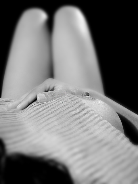
This week was a tough choice to post a titilating but technically less superior picture OR a technically perfect low-key picture of a handheld pencil...
Update[16-Feb-04]: 6.100, I am sure that I would not have got that with a picture of a pencil.
Also for the record - the DoF effect has been done 100% in PhotoChop
Statistics
Place: 31 out of 174 Avg (all users): 6.1000 Avg (commenters): 7.5000 Avg (participants): 6.1053 Avg (non-participants): 6.0921 Views since voting: 6028 Votes: 190 Comments: 19 Favorites: 4 (view)
This shot is, well, as you said titilating. Well done. You've clearly met the challenge, and I don't think that a pencil would have worked quite as well.
As always, Tarique, good stuff.
(You might think about re-entering this subject in the textures challenge...)
Something I've thought of doing. Good attempt and you did get the dof technically correct. So you are on challenge. The tones and lighting are good also.
There are a couple of things I might suggest. The towel makes the image look too much like a hospital shot to me. I apologize if there is a reason for it to be there. Try dropping your head down, maybe over the edge of your bed, that way you could do the view straight down the center and get both breasts in the shot. The hand looks oversized. I don't have a suggestion for that other than maybe placing it on your stomach or having the whole hand oof. Great try. You get a 9 for courage.
Nice idea. I find the cloth doesn't mesh here (excuse the pun) and the black OOF hair a bit distracting. Maybe silk or something more see through might have been nicer than the cloth, which, hopefully no offense, looks like a towel.
Nice chice going b/w with this shot! Somehow nudes always look better this way. I think it might look better, and more focused, if cropped a lot more off the bottom. I know that sounds radical but i think the large shadow in the lower left corner is grabbing too much attention. If it was cropped out completely, you could also make the rest of the image larger. And, not sure if anything could be done about the odd-shaped shadow between the knees. It's a great image, however. Good luck! 8
In this case, I believe that the shallow DOF actually detracts from the shot, at least as executed. I am distracted by the lack of definition between the hand and the legs. I (IMHO) think that if the focal point was a touch further back (so the whole hand was in focus creating a more distinct line) or the DOF was just a smudge (is that a legal tech term?) deeper that this would give the shot TONS of more impact! I would also have to say that I would like to see this shot in the original colors as this isn't contrasty enough to make a great B/W (again IMHO).
If it is possible, I would love to see this re-shot as I think as a composition, this is one of the best that I've seen so far for this challenge.
TC
I couldn't help noticing that there is quite a pleasantly shaped breast in this shot! ;)
Nice idea, but I'm not convinced about the confusing material, which is a shame because just the body on ots own would have made this very pure. Shadow close to camera is distracting and I think getting in closer would have maximised the DOF effect.
I would try cropping a bit from the bottom to align the nipple with the bottom rule-of-thirds line, and maybe include more space above the knees even. The black blob at the bottom doesn't do the (otherwise very nice) nipple any favors.
This is a beautiful image - the lighting is flattering to the skin tones and the composition is really unusual.
I'm not sure I like the inclusion of the hair - I think either more or none would work better in terms of composition, for me. And, although I like the texture and stripes of the cloth on her body, it feels a little too neatly folded and placed - I wonder if it would be more interesting with a few folds in it?
Altogether a wonderful image.
Beautiful compostion! Very well toned, I like the choice of B&W but also leaves me wondering what the color version was like. Excellent take on the challenge! 8





 Add photograph to your favorites
 Add photographer to your favorites

 Photographer found comment helpful.


