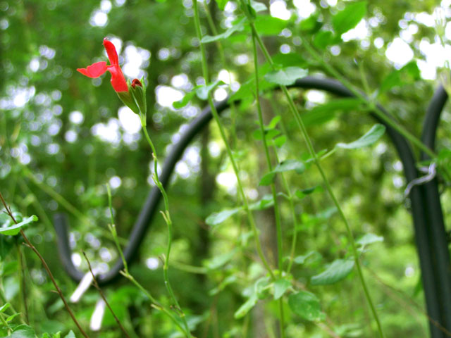
This has a little too much going on (busy) IMO and the 'S' doesn't do anything to help the photo. It's just kind of there in the background (if the 'S' is the shepherds hook). Ideally, the 'S' curve would be a gentle leading line to take the viewer thru the image.
Not trying to be mean here but as part of the purpose of this site is to learn, teach and become better photographers, I wanted to make mention of the point of the challenge.
An S-Curve is a compositional tool, like the rule of thirds or leading lines, that helps in making the image stronger. Normally, the S-Curve is to lead the viewer's eye through the image or to the subject. I've noticed a lot of submissions that simply include an S shape somewhere in the image but this misses the point.
If used properly, the S-Curve is a very powerful compositional tool. While your shot is nice, the "S" that you've included is really just an element and doesn't really lead the viewer's eye.
I do hope you'll take this as I mean it. I certainly don't mean to criticize your image.
Highlights are distracting. The idea of a spot of color again the green with the holder leading the eye there is basically a good composition. However, problems for me are that the stand center is not vertical and that I want to see nice detail in the flower. Even if the flower is small it should show detail and definition. Even bright red, it gets lost in the bright background highlights. The bright oof object on the end of the black bar is also distracting.





 Add photograph to your favorites
 Add photographer to your favorites


 Photographer found comment helpful.


