Challenge:Letting Go (Basic Editing I) Camera:Olympus C-740UZ Location: in my computer room, VA. Date: Feb 8, 2004 Aperture: F8.0 ISO: 400 Shutter: 1/30 sec Date Uploaded: Feb 8, 2004
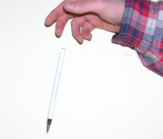
Was the idea to create an image of the hand leaving the pen? IMO, the pen and hand look as if they are placed on a surface. The peon or the hand should have given a feeling of motion.
this image seems overexposed and lacks quality... perhaps too much jpeg compression did that? technically it could've looked better if it was closer to 150K allowed here... the subject and composition don't present any interest to me either... as far as interpretation of the challenge is concerned, it looks to me like the hand and the pen are just resting on the flat surface, that's all...
Please choose 1:
A. A different coloured pen would contrast better with the background.
B. A different coloured background would contrast better with the pen.
If you are not actually going to drop it, and just lie it on the table, at least make sure the shadows are not so prominent. (or if you actually DID drop it, move further from a wall, because it takes from the value of the picture) =)






 Add photograph to your favorites
 Add photographer to your favorites


 Photographer found comment helpful.


