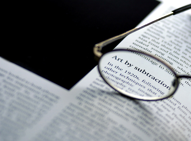
What a fantastic shot - well executed and composed. And the choice of text to use in the book (and as the title) is appealing too. I am frankly amazed this did not make top 10.
Really like this, good choice of subject, meets the challenge well. Only a few wee things, the whole area seen through the glass would have been nice if it was all clear and maybe moving the glasses to the right a little as it almost looks as if the word 'subtraction' is cut off. Well done!
Very nice - I love the creative composition with the pages sort of creating a checkmark against the black background, juxtaposed with your use of shallow depth of field to bring out the main subject. 8
This kind of shot is becoming a new cliche on dpc (glasses are the new cats, if you will... :-) ), but this is a good example and definitely meets the challenge. Whatever that plain white area is in the top right-hand corner (another sheet of paper?) is a bit distracting.





 Add photograph to your favorites
 Add photographer to your favorites

 Photographer found comment helpful.


