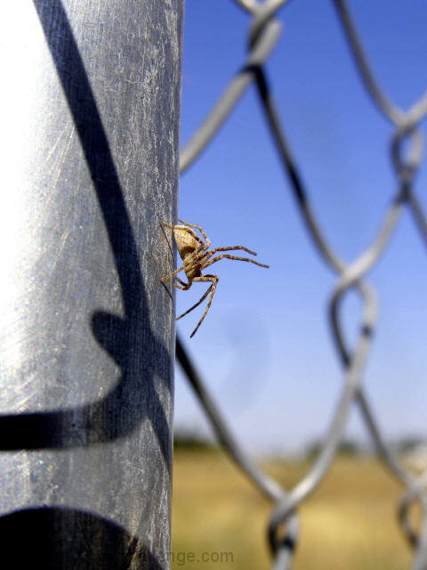
The lighting on this seems very harsh, looks like there was something done in editing to the right of the spider where the blue seems to have a dark streak from something.
avg vote, lighting is slightly off, fence backdrop is a little distracting, some sort of smudge or something in center of pic just below spider, but its not really a picture that grabs my interest and makes me want to stay looking at it
It makes me wonder what is beyond the bottom of the frame, he looks like he is getting ready to attack something down there! I also really like the fence in the picture, it is very refreshing from a flower or such. DOF is great, good variety of colors, just enough contrast between the fence and the spider to make him stand out. Good job!
If this is a study of a spider why does it fill so little of the image space? Get in there and fill the frame. Did you clone something out from the center of the image? There seems to be a discoloraton below and to the right of the spider.
Oh, I like this. Now if I could only explain why, exactly, I like this... I love the fence as the supporting structure to the spider's "pose" - I like the defensive/sensing pose of the subject. I love the shadow of the links on the post and the fact you caught the spider in just the right place. And of course the sky is a nice blue.






 Add photograph to your favorites
 Add photographer to your favorites

 Photographer found comment helpful.


