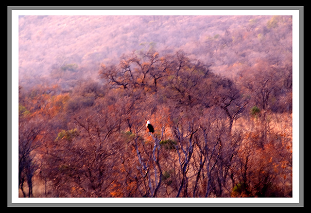
For me, your triple border almost makes it look like you took a photo of a photo on a wall. The outer thick black border detracts to em. Your image itself seems a little out of focus. Too bad you couldn't have gotten closer.
Not a fan of the bordering, the colors are not complimentary to the photo and it really spoils it. This picture suffers by the size limitation and may have voted higher in a larger format. Could have been good one for impressionism challenge maybe. I like the painterly effect in it. Avg vote
There are 3 things that would make this picture better:
1. The frame is to busy. No frame would make the picture larger and the eagle more visible.
2. Adding more sharpness with USM (//www.dpchallenge.com/tutorial.php?TUTORIAL_ID=4)
3. Adjust the colors. It has a red colorcast that can be reduced using Curves (//www.dpchallenge.com/tutorial.php?TUTORIAL_ID=24)
This is an interesting photo - is that an eagle in the middle? Since this is a fall photo, I'd like to see a better saturation of color, and also, it doesn't look like anything is in focus on the pic. For me, the border doesn't do anything but make the picture look smaller.
Oh man this is a rough one. I think there are just too many things not good about this image to list. The one I will mention though is the border. Really bad border. If you are interested in more of a critique please feel free to PM.






 Add photograph to your favorites
 Add photographer to your favorites


 Photographer found comment helpful.


