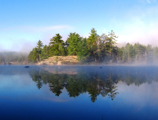
This is such a beautiful photo. I was hoping to see it on the front page. For me, a photo that you could hang on your wall or sell should ALWAYS win over the more gimmicky ones. . .but that's just me.
Less sky and more water would help horizon from being centred and the water is much more interesting. Beautiful time of day and weather, but a bit more angle on the light would help define the features.
I would have to agree with you on the title and idea! The photo to me has a lot of grain in it and I think a better composition might have been to place the taller trees and rock more to the right - a little less centered. It looks like a beautiful place!
nice picture, very beautiful scence. I will say the composition is a little lacking imo, generally speaking the horizon line is best placed in a third of the photo. Still a nice photo of a beatiful scene.
It is a gorgeous shot, but the horizon is in the middle. I think the crop should have been tighter on the top, also a tad tighter on the bottom to remove that twig.







 Add photograph to your favorites
 Add photographer to your favorites

 Photographer found comment helpful.


