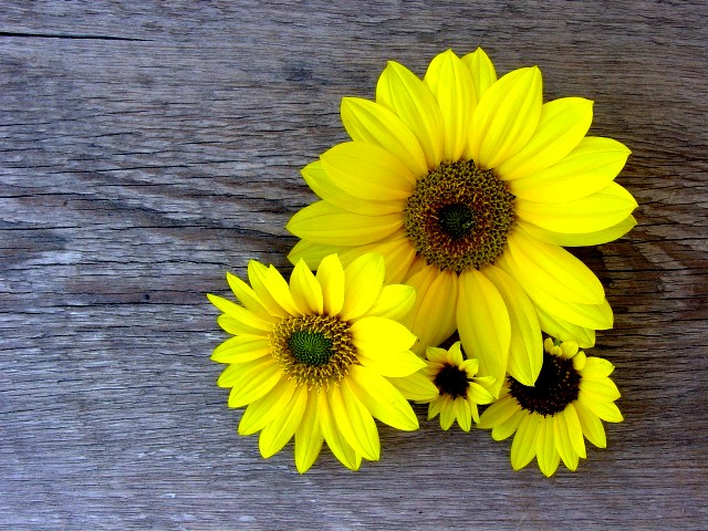
The negative space is the wood and the positive is the flowers. I feel the wood makes the flowers pop out a bit or say wow and because the negative is natural and not just black or white to me makes it even better. Maybe I did have to many flowers, but however I love this photo and am very proud of myself.
this is one of my 10's this week. great angle, color, and the neg space is clear, and flows well with the overall photo. Great job. good luck in the challenge. ~hbunch7187~
I really like the contrast of colors, the only thing is that maybe one flower or 1 large and a small would have more impact. Just a minor niggle. An excellent submission! Keep it up.
Really beautiful shot. The colors are perfect, the arrangement is pleasing. The wood contrast is good. Only thing different I might do is use just the big flower and the two smaller ones. I would lose the other one to give the illusion of more space. I might be wrong, but it's still nice anyway.
I am being honest and straight forward - Not to offend. I think this an excellent idea, technically great, I love the color and sharpness of the flowers. But, personally I don't like the wood. I know there is probably some strong reason for using the wood as a background, but for me it doesn' work as well as something else...then again I do like the texture of the wood and the fact that you did you something other than just black or white...OH what do I know, I can't even make up my mind...I think I've been commenting too long today :-0 Great work 7 Ruthann
This one caught my eye right off, I like the interplay of color and texture. I never thought of using negative space with so much detail, but this is great, one of the best this week (right up there with mine :) ) Zeiss







 Add photograph to your favorites
 Add photographer to your favorites


 Photographer found comment helpful.


